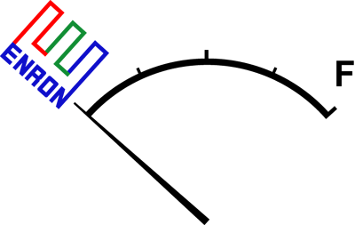
Replacement Enron Logo
Ah, Enron. Formerly of the many lobbyists and CEO who loaned our President his jet plane, now of the infamous implosion and subsequent bankruptcy.
In light of this, Viridian invited people to redesign the original Enron logo. As Bruce Sterling said his call for logos,
When companies merge, or change names, or even re-org, a logo redesign is very often job one. But when companies croak in a grotesque welter of scandal and bankruptcy, nobody does a thing about the logo! Dead companies don't even get new logos.
However, we Viridians, with our wise "Embrace Decay" principle, can see through this serious organizational shortcoming in contemporary capitalism! And if anybody needs a new logo right now, it's Enron.

The original logo took the "E" from Enron, put it in three strong colors, and added "Enron" to its side. The whole thing was then tilted counterclockwise. Perhaps this wasn't meant to indicate instability.
I took this original design and tweaked it some. As is customary with logo redesigns, I used elements from the original logo.

If you're interested in using this logo for your own purposes, please email me and let me know.